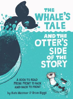
In some picture books, the book’s design is almost incidental: readers barely notice it. Other times, illustrations are creatively placed, such as on the dedication page, or lining the inside covers, and readers notice and appreciate the book’s design, but don’t focus on it.
In the case of The Whale’s Tale and the Otter’s Side of the Story, the book’s design is central to it and its success and is foregrounded accordingly. The book’s subtitle is “A Book to Read From Front to Back and Back to Front”–and both the words and images make sense read in either direction.
Read front to back, the book presents the whale’s side in a debate over whether whales or otters are “cooler,” and ends with the whale winning the debate. On the first read, the book’s pleasure comes from the bold claims the whale makes, and from the fun, cartoonish images. So far, so good.
But then there’s a page guiding you to read the book in the other direction. Same words, same images, but this time, the otter wins the argument.
The result, at least for me, was a kind of head-shaking respect, a “How did they do that!?” But author Kate Messner and illustrator Brian Biggs pull it off. What’s more, they create a book that encourages kids to read closely, to flip back and forth, and to analyze how the same thing has different meaning depending on context. That means this book that appears to be a jokey gimmick can lead to quite serious reflection on perspective, argument, and communication. It might even lead to discussions about ego and self-importance, as it shows that both animals are central to ecosystems and neither can be “cooler” at all times. (Two pages at the end provide larger context and tips for further study in a more traditional format.)
Good stuff.