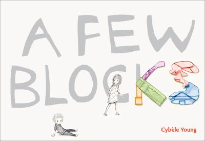
The first thing I noticed about Cybele Young’s 2011 picture book A Few Blocks is its design. It is laid out horizontally, like a landscape painting, so it is wider than it is tall. This sets it apart from most books, but more importantly, it fits with the story and its theme.
The first page lets readers know it’s “time for Ferdie and Viola to go to school”…and the entire rest of the book follows their preparation and attempts to go. The book’s horizontal sprawl transforms over and over, first dramatizing the width of the room and the challenge of getting a kid who doesn’t want to go to school in motion at all, then shifting to vivid, delicate landscapes of imagination, as Viola tries to coax her brother into motion.
Some pages are almost all white, letting the space express the distance between characters–and Ferdie’s stubborn, lonely resistance. Other pages are filled with the colors of his sister’s imagination–and Young’s lovely art.
There are multiple reversals, shown through character posture, character direction on the page, action (who’s tugging) and dialogue. This is a book that is full of beauty and fantasy, and is extremely realistic about kids’ worlds and the way their emotions and imaginations can fill and color the world.